So far, my experience with the new Google Sites released at the end of November, is pretty much the exact opposite. It may have a lot fewer bells and whistles, but that, in my opinion, is made up for in ease of use and practicality for the busy teacher. I am highlighting 3 of the things I like about the new Google Sites in this blog, but the "Classic"Sites is still going to be around for a while yet if you decide the new version is not for you. Be aware, however, that there is currently not a way to convert between the 2 versions, so you might want to consider starting with something that is not high-stakes.

1. It is EASY to edit!
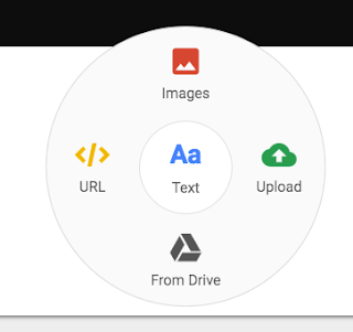
To get started, you just have to select what you want to do on the navigational menu to the right, or (I found out by accident) by double clicking on the page to bring up a smaller round version of the menu.
You can select to add text, add an image, add a URL link, add an item from your Drive, or upload an item directly to the page. You can even embed items directly to your page with a click or two. Additional pages on your site can be seen by clicking on the Pages tab at the top of the large navigational menu, or you can check out the different themes available by clicking on the Themes tab.

Uploading items from your Google Drive is super simple, and while you can still create links to your items the old fashioned way, you can also load a scaleable version right to the page. The options on the page are very drag and drop oriented. You can even drag some items right from your desktop to the page, and rearrange by moving items around where you want them.

2. It can make you look good!
Even those of us who are design-challenged, can make a site that is relatively clean looking and visually appealing with little effort. While you don't have a lot of font or theme options, this can actually be a good thing. The theme-based design format provided helps you set up a theme and then only allows you to choose fonts and components within that theme. So, for those of you that just don't know when to stop and end up adding 13 different fonts and 6 different backgrounds to the same document, consider yourself reined in. Once you play around with your options a bit, you are bound to find a combination that is aesthetically appealing and still easy to navigate.
 |
Four section options based on theme.
|
 |
| Four text options for each section of text. |
I would provide one cautionary bit of advice, however. The ability to put complete documents on your page is definitely a benefit, and while it helps share immediately what you want to communicate, you might not want to do this with every document or your page will get extremely long. You can alleviate the issue by simply creating an old-fashioned link to some of the items or by creating separate linked pages to display different groups of items.
3. It is EASY to publish and display!
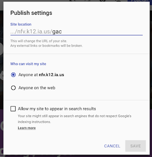
When it comes time to publish, the new Google Sites is just as easy as it is to edit. Actually, it is easier. Just click on the Publish button at the top and you will be walked through your options. Once again, they are pretty simple and streamlined, so it is quick and painless. And BONUS... your new sites are now stored in your Google Drive so they are easy to find when you want to edit them!


Another positive for the new sites is that it is designed to automatically adjust the display for optimal viewing on phones, tablets, and large screen devices. It even allows you to see how your page will display on each of the devices in the preview menu.
While I wasn't completely sold at first, I have quickly decided that the new Google Sites is a good move. I am definitely a fan of having a lot of options in creating useable technology, but in my opinion, the ease of use and cohesion of options in the new version more than makes up for the minor limitations.
I have recently helped a couple of teachers use new sites in their classes and they seem to like it, but there's only one way for you to decide if it works for you. Give it a shot and see what you think. As always, don't hesitate to chat with one of the instructional coaches if you have any questions or ideas you want to pursue. We love to help!
Here are just a few example sites to spark some ideas how you can use the new sites:
Click here to view a simple site with lots of images that was put together to introduce Google Arts and Culture to teachers.
Click here to view a site put together by Tracy and I to provide easy access tech resources to students.
Click here to view a site put together as a portfolio for my master's work. The pages are not populated yet, but the skeleton is there. This format would work really well for teaching portfolios.

No comments:
Post a Comment